Painting Rooms: Let’s talk color – Pale Oak by Benjamin Moore
 We finally got around to painting our master bedroom! Ha ha, take that builder’s beige! It took me a long time to pick a color and I wavered between white and grey for quite a while. The color I finally settled on, BM Pale Oak, is actually a great compromise between the two. It is such a versatile color too. I could totally see this fitting with any type of decor style. It would look equally as good with modern white furniture and pops of bright color or a more country style with linen furniture and neutrals. If you want to go with a white room but don’t want a stark white this is an excellent choice. It doesn’t have any odd colored undertones either. It’s just a nice reliable pale grey.

No full room pictures yet because this room is not even close to being finished. In fact, it is in a galaxy far, far away from being finished. But at least we aren’t on the “dark side” anymore. Here’s what it looked like before. (Note: This is an MLS picture from the former owners…not my decor!)

 I’m really thrilled with how this color turned out. It is going to be the perfect backdrop for what I want to do with this room. And it’s NOT beige!!!
What are your favorite paint colors these days? 
Paint Screen Turned Jewelry Organizer
Don’t you love it when a simple solution to a problem presents itself? I know I do! I’ve never really had a great way to store/organize my jewelry and lately it has been encroaching on the bathroom vanity and the shelves of my walk-in closet. I tried using different containers but having it in something where I couldn’t actually see it doesn’t work for me. Out of sight out of mind, you know. My original idea was to put screen or some kind of small wire fencing behind an empty picture frame but that wasn’t a perfect solution either. I have tons of bracelets (I love me a good arm party!) and will more than likely continue to acquire them and the whole picture frame thing didn’t really solve that issue to my satisfaction. So I got Mr. Sturdy in on my dilemma knowing that he would more than likely come up with some good ideas. True to form, he did. He took me shopping at the hardware store and we walked up and down the aisles looking for things that we could use in a different way. That was kind of fun in and of itself. Try it sometime. Open your mind and look at things not as what they are intended but as, “what else could I do with this?” Thanks to that outlook I found this guy.

He is a paint roller screen for 5 gallon buckets of paint and is usually used like this. (via familyhandyman.com)

It initially caught my attention because of the screen and when I picked it up and took a good look at it, it became the perfect jewelry organizer. Sometimes you have to turn things backward and upside down to find it’s true potential. That’s a little Sandyism for you. We bought some S hooks and a handful of small corks to use as spacers and that’s it. The whole shebang cost less than $12.00 (and that was for two.) Eventually I’m going to spray paint them white but I just needed to get myself organized. When we get ready to paint the beige walls in the Master Bathroom then I will go ahead and paint these babies too. Take a look. FYI, they also come in silver.

Now let me show you the minimal work it took to make.

The best part is that the basic object is already made. You just need to add spacers, hang it on the wall, add some S hooks and put your jewelry on it.
It can’t get much easier than that. Here are some more views.


This super simple solution has me feeling so much more organized and put together. I love having a place to put my jewelry where I can see it and have it easily accessible. I’m linking up with Tutorial Tuesdays at Hope Studios and One Project at a Time at Bowl Full of Lemons.
Have you used anything in a unique way lately?
True Colors…the quest for the perfect grey paint
Let me get this out of the way first of all. I spell grey with an “e” not and “a”. I’m not British, I just prefer it that way. Grey is a moody color like mist, smoke, or storm clouds and, in my opinion, when spelled grey the word itself looks moody. Like looking through half-closed eyes. When you spell it gray it looks all bright eyed and cheerful which is not what what I think of when I conjure that color. Silly? Yes. That is just a small sample of the strangeness that is my brain. See what I have to deal with?
On to paint. Choosing a grey paint to be more specific. Yikes! Grey is a hard color to get right. It can really be a chameleon of color. With undertones ranging from blues, purples, and pinks to browns, yellows, and greens, it can be a trick to pick the perfect one.
Our fireplace only has rock up to the mantel then is drywall the rest of the way up to the ceiling. We talked about painting the area above the mantel a grey color that would tie in with the grout and stones of the lower portion to help it look more finished. It would also add an accent color to the wall color we want to use for that room. So, that didn’t seem too difficult really. Just a medium grey, right? Based on paint chips I had collected I tried a test can of Benjamin Moore Rock Gray (they spell it with an “a”).
That looked absolutely navy blue in my house. Not a freakin’ hint of grey to it. Next I tried Benjamin Moore Sabre Gray. This color does not look blue at all on the chip or in the can. But guess what? On my wall, it looked blue. Unbelievable! A greyish powderish blue. See that’s the thing with color, it reacts to light and to the things reflecting around it and so you can’t just see a color on a chip, or in someone else’s home, or on the internet and expect it to look the same in your home. I guarantee you it will not ever look the same. And this wall has very little natural light and it comes in from a weird angle so I knew this was going to be a hard nut to crack. Next I tried Kendall Charcoal also by Benjamin Moore. It was too dark for my taste and also (I hate to say it) did start looking blue to my eyes after a while. I started to think that maybe there was just something wrong with my eyes and I could now only see colors in shades of blue. Oh that would be bad! My husband liked it and said he didn’t think it looked blue at all. Then I was sure I was going bonkers. Still not happy I went back to the drawing board (or should that be the paint palette?) On a trip to visit my parents I started looking at a brick fireplace that my mom had painted. It was the prettiest smoke grey and it looked like the perfect color for our fireplace wall. It was Behr paint called Anonymous.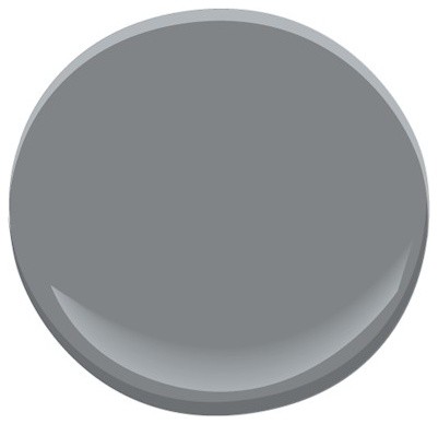


Mom told me that she had lots of paint left over and I could have it to take home and use on our wall. So it came home with us and I tried it out. Womp womp. On my wall it didn’t even look grey. It looked tan! At least it wasn’t blue. Thank God for small favors. At this point I began to seriously question my color picking ability. An ability that I used to depend on, and trust, and have confidence in. Then I started looking at the two painted swaths on the wall, one was BM Kendall Charcoal that was too dark and the other the Behr Anonymous color from my mom, and my brain started mixing those two colors together. I pondered this idea for a while and then I did a little test. I mixed two tablespoons of each color into a plastic tub and tried it out. Painting it on it didn’t look good and I figured I was in for another failed attempt, but when it dried, magic happened! A perfect shade of not blue, not too dark, not too tan, grey! So pretty and almost the exact color of the grout in the rocks of the fireplace! Needless to say I got right on mixing a bigger batch of paint. Once finished, the clouds parted and a shaft of light beamed upon the newly painted wall. Actually it was just the light that I turned on above the fireplace but it had the same effect. (The beige colored walls look different in the side by side picture but it’s just due to different time of day lighting.)

It was kismet really. Had I not struggled to find the perfect grey paint I wouldn’t have had the ingredients to create the perfect grey paint. Boom. Mind. Blown. Plus I really like the idea that I have a color that no one else has. I think I’ll name it “Grey With An E”.
P.S. My dream job would be naming paint colors. Seriously.
P.P.S. My mantel already looks different. It is such a massive thing that everything I was putting up there looked teeny tiny and ridiculous. It’s getting better. I’ll do an updated mantel post soon.
P.P.P.S. If you take anything away from this post let it be, “Always test your paint out before you commit to the color and don’t be afraid to mix your own color. Magic just might happen!”
If it is possible to have a love affair with a paint color then I think I’m having one. Sorry Honey. I’ve had a crush on minty greens for a while now and I never thought I would really go for it because, you know, it’s minty green. But then I kept seeing pictures all over the internet with this wonderful color on the walls such as this room makeover by the amazingly talented Kristin Jackson of The Hunted Interior.
 Kristin has such a way with colors (and I love a room with lots of color!) There aren’t many people I would allow to redecorate my house for me without my being involved but I would give Kristin carte blanche on my home any time.
Then there was this beauty by Kate Spade, of course.

and more like this…

via pinterest
and this…

via BHG
What I really love about this color is how it acts as a neutral with all the other colors going on in the rooms.
Since I was so smitten, I knew I would be disappointed if I didn’t just go for it. First I came home with a test pot of ACE paint, Mint Julep, but it didn’t last. Mint Julep came on too strong. I don’t like that in a paint. So just when I was wondering if my crush would ever bloom into real true love…I was introduced to Willowdale. *sigh*


The pictures don’t do it justice. Trust me. It is the perfect light minty green hedging toward aqua. It doesn’t look as white as it does in the first two pictures but it is a very pale color yet not too babyish and not too hospitalish. Just perfect. I told my friend, Cyndi, that I loved this color so much I wanted to lick the walls. Too much? All righty then!
I can’t wait to watch the evolution of this room now that I’ve got my perfect wall color. As you can see from my granny squares throw on the end of the bed I want to bring in lots of bright colors grounded with black and white. The heirloom bedspread was a steal at $15. Eventually there will be a little upholstered headboard DIY going on in here. I’m also picturing brass swing arm lamps on the end tables and a gallery wall.
The first of the boring builder’s beige rooms is officially transformed and I’m so glad I was brave and went with my color crush. What colors have you been crushing on lately?
We started painting over the builder’s beige finally! We tackled the guest bedroom first because it is the smallest room and the only one that doesn’t have a vaulted ceiling. So it was easy. I don’t have any pictures because the room isn’t completely put back together yet. But I must say, even just having one room done helps my outlook so much. I love walking in there and taking a break from all the beige (there isn’t a wall or ceiling in the entire house that isn’t that color.) It is like having an oasis in the middle of a beige desert. Ahhhhh! I could go on and on about how much I love that room but I wont. You’re welcome.
What I will go on about is how much I enjoy painting. I know. I think it’s something you either love or hate. Me, I’m a luvah. One of the things that helps me with painting (because I’m a “let’s just get on with it!” kind of gal) is not taping off edges before cutting in a room. It save a boatload of time and in my experience most of the tapes don’t really seal paint out unless you do a whole lot of extra steps (fugetaboutit!) or the tapes that do seal well are super spendy. Me, I want to crack that can of paint and start going for it. After laying out my drop cloth of course.
So I thought I would share my process of painting the edges of a room without taping. I am using the baseboard as an example but the steps apply to any edges. Windows/ceilings/doors are all edged using this process. So without further ado…

 This may be obvious but I’ll mention it…the side of the brush with paint on it needs to be the side that will face the wall when holding the brush with the short end facing you and the point end of the brush away from you. Sorry, I’m not trying to insult anyone’s intelligence. Just trying to be a clear communicator.


The ceiling tip is only for rooms that do not have crown molding. If your room has molding around the ceiling use the steps as described here. If you don’t have trim around the ceiling and you have textured walls paint will have a tendency to splooch into the tiny little indentations of the texture along the transition from wall to ceiling. This will give a gloppy looking line. Using an artists brush with a flat line will give you more control by pushing it up to the top of the wall giving you a nice clean line.
I hope this helps! I’d love to know your painting tips too!

We have arrived! Introducing our new house.
We moved into our new house on April 1st with sunny skies, green grass, and blooming trees to welcome us. After leaving 5 feet of snow on the ground and nights still getting below zero that was a warm welcome indeed. Our first house offer fell through at the last minute so I ended up flying back down by myself in February to go house hunting again. That meant that the love of my life moved into a house he had never been in. I did take video for him so he sorta knew what he was getting into but still…that is a pretty huge amount of trust he had in me. But he continually reminded me that home is wherever we are together not a specific house or geographic location, so that helped me not feel quite so pressured. I didn’t have to worry after all, though, because as soon as I walked into this house I could just picture us living there. It was US. It is a bit “builder’s beigey” but we have a lot of ideas for making it our own and customizing it so that has me excited about future projects. For instance, we want to make built-ins on each side of the fireplace and also build an island for the kitchen.
So, without further ado, meet our new house. (Some pics are from MLS listing so have previous owners decor etc. Some are post us moving in and have paint test swatches all over the walls.)


decorating for the future
Our house is due to close in about a week! That means I’m busy packing and cutting the weak from the herd (that is taking the stuff I don’t want to our local free box.) I could swear we sold about 3/4ths of our belongings this summer in a yard sale but getting down to packing it still feels like there’s an awful lot of stuff. In a couple more weeks we are going to have a furniture sale and hopefully get rid of the bulk of that collection as well. Yep, we’re gonna go bare bones for a while. I’m actually looking forward to it. It’s time for a fresh start in every way. I can’t tell you how excited I am to be getting a fresh house with fresh bare walls. An empty canvas!
When we were out house hunting with our realtor we had narrowed it down to two houses. That night Butch and I were talking over the pros and cons of each one trying to make the choice and I was quiet for a while. He asked me what I was thinking about. “Oh,” I sighed, “there is just a lot going on in my mind. Right now I am simultaneously redecorating two houses at once!” Was he surprised? Not one little bit! We did finally end up with one particular house and the ball is rolling on that purchase as we roll to the end of our other house selling.
So in my down time (what little bit I have) from packing I’ve been playing around with different decorating ideas on Olioboard. Haven’t heard of Olioboard? It is a digital mood board tool that you can use to create 2D or 3D visuals for decorating rooms utilizing their extensive library of furniture and accessories by all your favorite brands. And it’s a whole lot more than that too. The Olioboard community is a wonderful, friendly bunch of amazing decorators and artists. If you’ve never tried Olioboard it is free. You can always upgrade if you want to which does cost a monthly rate, but I’ve been able to do everything I need/want with it in free mode. What I like most about Olioboard/making mood boards for rooms is that it helps keep you on track. Not that I have to buy the exact items on my board or that I can’t get something that isn’t on it. I think it just helps you realize the look you are going for. And by referring to your mood boards you can decide whether or not something is right for that space instead of bringing home random things and trying to make them work together.
This is one of my idea boards for our future living room.

Kinda cool, huh? You can really get a feel for colors and styles of furniture and how everything will look together. You can actually put together a whole 3D room. Here’s another one for a dining room. This one is a 2D mood board.

I guess you might say the look I’m going for is sort of Farmhouse/Industrial with some modern touches thrown in. The table is something we plan to DIY. A live edge wood top with some kind of industrial iron legs. We would love some industrial lighting or to make our own light fixtures with some cool bottles or something unique like that. I had originally picked out different chairs but they didn’t pass the husband test so I went back and picked out 7 more examples of styles that I thought we could both agree on (although none of them are the color I am imagining.) I want to keep the room a tad more on the casual side because we are more casual people. But my husband thinks that table is very classy and doesn’t want to bring it down with casual chairs. I say it’s like wearing a fancy top and jewelry with a pair of jeans. They balance each other out not too fancy, not to casual. And I was completely in love with those curtains (World Market) until I saw the zoomed image and realized they were not the colors I thought they were. Bummer. Ha ha, here I am agonizing over curtains for a house that I don’t even live in yet! Yep, that’s me.
Do you ever decorate spaces in your head? Have you tried Olioboard? If not, you definitely should at least go look. It is very inspiring!
diy rubber stamped tile coasters

We had a big moving sale two weekends ago and rid ourselves of all kinds of things. Lightening the load in preparation for moving and an opportunity to shed all that accumulation (of what?) that happens over time. The idea of starting fresh and uncluttered in a new house appeals to me. But in my zest to divest myself of material goods I kind of went overboard and got rid of something we use every day. No, I didn’t sell our toothbrushes or the kitchen sink. I sold the coasters. Gasp! Not a big deal item in the big picture. But when your husband has to precariously balance his cup of coffee on his knee, the arm of the couch, a stack of magazines, or whatever else he can find in lieu of direct contact on the vintage end table and he starts constructing imaginative stacks of items as makeshift-coasters-please-get-the-hint-honey…then you know you’ve gone too far.
“Where are the coasters?” he asked patiently one day.
“I sold them in the moving sale.” I replied sheepishly. “I may have gotten a little too excited about selling stuff.”
“Really?” he replied. It was more of a statement than a question. As in, I’m not surprised. In the least.
So during my next trip to town I stopped at V.V.’s to see if they had any coasters that could fill our need. I didn’t find any but there was a bundle of tiles that were just the right size for coasters. Eight tiles for four dollars seemed a good deal and although they were a little bland looking I knew I could jazz them up so I got them.

To do this project all you need: Tiles, StazOn brand stamping ink, rubber stamps of your choice, stick on felt pads or felt and glue. Then it is simply a matter of stamping whatever design you want on the tiles. Seriously. If you can operate a rubber stamp then you can make these. Your kids could make these.
Make sure the tile is clean and free of any tile dust. Ink you rubber stamp and press firmly but not too hard or the stamp might slip on the surface of the tile. You want a nice clear impression.


Continue to stamp your design. It can be as simple or elaborate as you wish. You could personalize them for your own home or a nice hostess gift.

I noticed some open spots on this one that I wanted to fill so I grabbed my 7 gypsies express stamp that has 12 different words and phrases to choose from and filled in with words here and there until I liked it.


Once it is finished, turn it over and put felt pads at each corner or glue a piece of felt on the back. The felt pads I used were larger than necessary but they were what I had on hand.

Place on tables to use and enjoy!

Don’t you love fast and simple projects like this?! I know I do! I think my husband will be happy with them as well. And that’s always a good thing.
I’m linking up for Frugal Friday at the Shabby Nest , Simple Home Life’s Simply Creations and Funky Junk Interior’s Saturday Nite Special link parties
don’t knock it till you try it.
Not that long ago I shared in a post that I really don’t care for the trend of sorting books according to color. And technically I still have to say that I don’t. However.
Since we have our house on the market and are in the process of getting ready to move I have started packing a bunch of stuff away in an effort to better stage the house. “Depersonalize it!” as my friend, Regina, says. I just figure the less clutter a buyer has to look over to see the house the better. So while I was cleaning out the bookcases I decided to give the color method a try. Just for fun. A kind of don’t knock it till you try it experiment to see what all the fuss is about.
First I culled out every paperback keeping only the nice hard bound books. Then I removed all the dust jackets (carefully folding them and packing them flat just in case I ever want to use them again.) and sorted them in piles of color. Then I started to replace them on the shelves. This took a bit of time because exactly what I predicted would happen in my original post happened. I became a bit anal about the whole thing. Half-way through I began muttering about opening a can of worms and my husband just chuckled and shook his head. He did not get involved. He is a smart man. Sorting by color is not as easy as it looks if you are like me. But over the course of a couple days of fiddling around with it I finally got it worked out in a way I could live with.

And I have to admit. Just to look at, I actually do like it. Just to look at. But please don’t ask me to find a book. I wouldn’t know where to begin. And please, please don’t bring up the fact that I only have 2 yellow books because it is driving me crazy! And no, I will not be styling my book cases like this ever again in the future. But hey, at least now I can say I tried it.

One thing that I did learn and will use in the future is that I like less books per shelf. Here is a pathetic before picture.

And after…big difference, huh?! The open uncluttered look feels so good. I’m digging it in the rest of my house too. Perhaps I’m turning into a minimalist? Nah! But the whole less-is-more idea is definitely sticking with me.
Have you ever tried any decorating trends just for fun or experimented with decorating to see if you liked something?
don’t plan on it…
Have you ever heard that saying, “we make plans and God laughs” ? Well…it seems to be a theme for me this year. Just when I think I am really rollin’ on something. ERCH! (that’s the sound of screeching brakes just in case you were wondering.) So I guess I shouldn’t be surprised by this particular change of plans because it is something Butch and I have been talking about for quite a while now. Moving. You see, our last “vacation” was actually a scouting mission looking for potential places to move. But I think in the back of our minds we were projecting at least a year out. And the way we talked before we left for our vacation was like we certainly didn’t think we were going to come home with a definitive answer already fixed in our minds. You know, we were going to sit down and make a pro/con list for each place and do that whole scene. But that is most certainly not what happened. Once we were back home and we just knew where we wanted to be and everything seemed more black and white we started wondering why wait a year? So, in a couple weeks our house will officially be listed for sale. Wow. Now we do understand that with the housing market we may end up waiting a year anyway, but it just made sense to us to start the process right now and see what happens. 
That being said, all the projects that I’ve been working on. Trying to work on. Saving up to work on in the future. Those are all full stop. Typically I am not a person who shifts gears quickly and easily. I like time to process things. But I also know that change is good and this change really excites me so I’m totally on board and puttin’ her into high gear. All I can say is some artsy-craftsy people are going to hit the jackpot at our moving sale because, while I am not a hoarder in my personal/home decorating life, I am a project hoarder of epic proportions. Yesterday I was wandering through my stocked shelves remembering all the things I was going to do with this…and this…and this, and I was super-mega embarrassed by my pile of unused ARTifacts. Then I had an epiphany. I am instituting a ruthless “use it or lose it” clause at our next home or else! That’s it. End. of. story. After that I actually felt happier and more at peace. I learned something ugly about myself but I am willing to face it, change it, and use it to grow. Now I’m going through the whole house and culling out what we don’t need, use, want and adding it to the mountain that is our future yard sale. This is going to be a busy summer! 
Oh I should also mention that we have 2 months worth of company already lined up to come see us this summer (planned before we decided to move.) So that should really make things fun if they weren’t already! And I am also teaching a class on making polymer clay tiles in July! (almost forgot about that one! oops.)
Considering all this, I have given myself permission to not be on my computer much and have released myself from my blogging goals during this season. And I am not going to finish any of my current projects. There will be time for that this winter (wherever we happen to be.) I know it is probably going to be crazy busy and I just don’t want to add more on my plate than I can reasonably enjoy. And I have purposed that I am going to enjoy every day and be in the moment so that I can savor the end our our time here in Alaska. We love it here. It has been home for us for a good long time and we have friends here who are more family than friend. We don’t feel like we are leaving something so much as going TO something. I might pop on for an occasional post if I feel inspired but then again…maybe I wont.

How do you handle change? Do you hoard projects like me? Do you have a use it or lose it clause? How does it work for you? I want to know!!!
I hope you have a stress free and enjoyable summer!